The Vivid Perspective Series, Digital Marketing Strategies 2026: Part 4 of 4
When a Website Looks Good… but Doesn’t Work
A school administrator recently said with exhaustion, “Our website looks fine… but no one can find anything.”
A nonprofit director shared a similar frustration: “People visit our site, but they don’t take action.”
A small business owner added, “We redesigned our website last year — but it hasn’t increased a single lead.”
These leaders all believed what many organizations still assume: If your website looks good, it should work.
But the truth is sharper — and more freeing: A beautiful website is not the same as a useful website. A useful website is not the same as a lead-generating website.
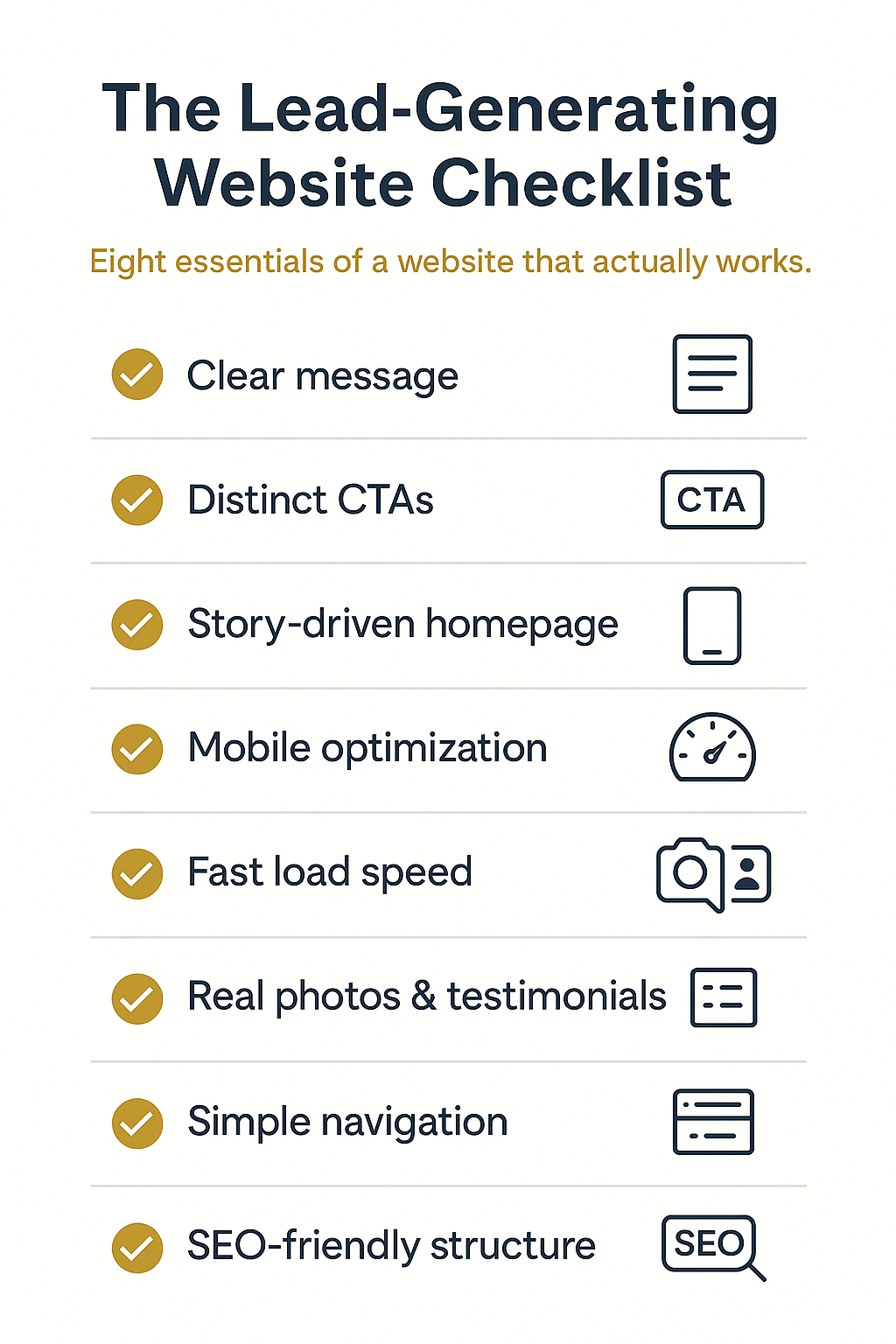
Most organizations don’t need a new website. They need a website that:
- Clarifies their value
- Tells a compelling story
- Guides visitors toward action
- Builds trust
- Works on every device
- Helps people find what they need
- Generates leads, donations, or engagement
- Reflects their mission and purpose
This story shows you how. We will blend brand storytelling, UX structure, technical performance, SEO, and lead-generation strategy into a single, comprehensive approach designed for small businesses, nonprofits, schools, and civic organizations.
If your website is not producing leads, inquiries, donations, or engagement, it’s not a design problem. It’s a clarity and structure problem. Let’s fix that.
Why Most Websites Fail (and Why It’s Not Your Fault)
Organizations evolve. Services expand. Priorities shift. Audiences change. Teams get smaller, workloads get bigger, and the website — inevitably — becomes crowded, unclear, outdated, or overwhelming.
Here are the five most common reasons websites underperform:
1. The website was built for aesthetics, not outcomes.
Many sites start with visual design instead of strategy. But design without purpose creates confusion.
2. The homepage doesn’t tell visitors what the organization actually does.
If a visitor can’t understand who you serve and what you offer within 5 seconds, they leave.
3. The site lacks clear calls to action (CTAs).
No direction = no response.
4. The content is too long, too dense, or too scattered.
People scan — they don’t read.
5. The site is not optimized for mobile or SEO.
70% of nonprofit and school traffic is mobile. Over 90% of all traffic begins with search.
Your website’s success depends on clarity, not complexity — and clarity is something every small organization can master.
The Top 25 Website Questions Leaders Ask in 2026
These are the most-searched questions small organizations ask.
1. How do I make my website generate more leads?
Answer: Clarify your message, add strategic CTAs, simplify navigation, and create a lead magnet.
Micro-Story: A tutoring center added a “Download the Homework Success Guide” button — inquiries jumped 37% in 60 days.
2. What should the homepage include?
Answer: Clear headline, sub headline, CTA, problem-solution story, services, testimonials, and contact options.
3. How do I know if my website messaging is clear?
Answer: If a stranger can understand what you do in 5 seconds, your messaging is clear.
4. Why does my website get traffic but no leads?
Answer: Visitors don’t know what action to take — or don’t trust the site enough to take action.
5. What makes a website trustworthy?
Answer: Testimonials, photos, clear language, certifications, team images, and transparent contact info.
Micro-Story: A dental practice added a “Meet Our Team” section — appointment requests increased.
6. Should I rewrite my homepage?
Answer: Yes — homepages should evolve as your audience and offerings evolve.
7. What are the most important website pages?
Answer: Homepage, About, Programs/Services, Get Started/Enroll/Donate, Contact.
8. Why is my website slow?
Answer: Large images, outdated plugins, poor hosting, unoptimized scripts.
9. Does website speed affect leads?
Answer: Yes — slow sites suffer high bounce rates and reduced trust.
10. How do I make my website mobile-friendly?
Answer: Use responsive design, short paragraphs, button-style CTAs, and simplified menus.
11. Should nonprofits tell stories on their website?
Answer: Yes — storytelling increases emotional connection and donor engagement.
12. What is the best CTA for nonprofits?
Answer: “Donate,” “Give Today,” “Join Us,” “Get Involved,” or “Learn How You Can Help.”
13. What is the best CTA for schools?
Answer: “Enroll,” “Request a Tour,” “Learn More,” “Contact Us.”
14. What is the best CTA for small businesses?
Answer: “Schedule Now,” “Get a Quote,” “Book a Visit,” “Start Here.”
15. Why is my bounce rate so high?
Answer: Poor messaging, confusing layout, lack of mobile optimization, or slow load times.
16. Should we add video to our site?
Answer: Yes — short homepage videos increase conversion and engagement.
17. What images build trust?
Answer: Real people, real locations, real community moments — not stock photos.
18. What is the best website layout for 2026?
Answer: Simple, vertical storytelling layout with clear sections and consistent formatting.
19. Should we use pop-ups?
Answer: Yes — but only for lead magnets and only after visitors scroll.
20. How do we get more people to contact us?
Answer: Use CTA buttons, short forms, and invitations throughout key pages.
21. Should every website have a lead magnet?
Answer: Yes — especially small organizations. Lead magnets accelerate inquiries.
22. How do schools improve website clarity?
Answer: Reduce pages, simplify menus, prioritize parent-facing content.
23. How do nonprofits increase online donations?
Answer: Clear story + clear CTA + simple donation form.
24. What is the biggest website mistake small organizations make?
Answer: Trying to say everything at once.
25. What improves a website fastest?
Answer: Rewrite the homepage — it drives the greatest return in the shortest time.
Now that we’ve covered the big questions, let’s explore what actually transforms a website into a lead-generating machine.
The Lead-Generating Website Framework (Hybrid Messaging + Conversion Strategy)
To turn your website into a lead-generator, you must combine:
✔ A clear message
✔ A story your audience connects with
✔ A simple, scannable layout
✔ High-quality visuals
✔ Helpful content
✔ Trust-building elements
✔ Strategic CTAs
✔ SEO + mobile performance
Here’s how each part works.
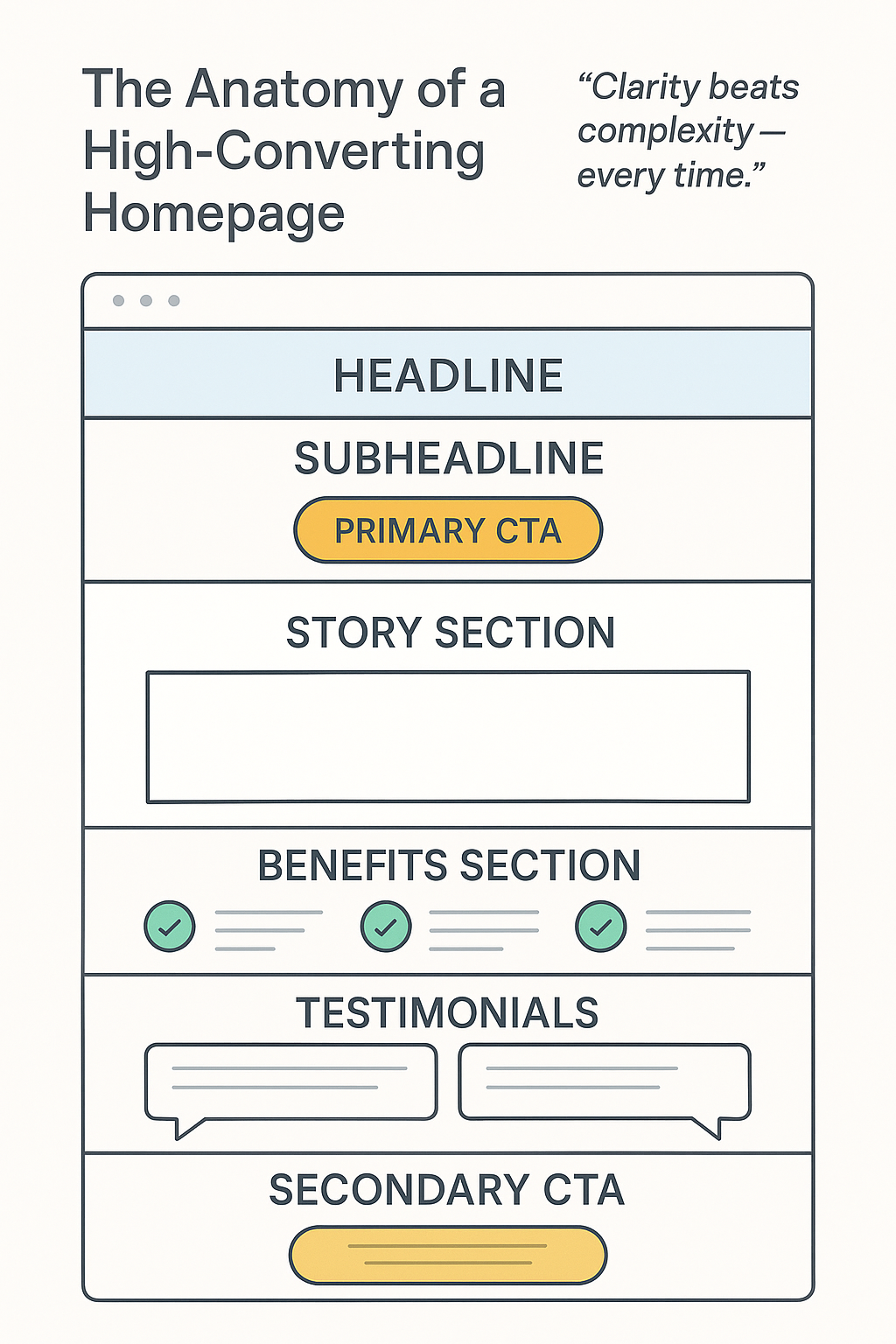
Part 1: Clarify Your Message (Your Homepage Story)
Your homepage should answer:
- Who are you?
- Who do you serve?
- What problem do you solve?
- What transformation do you create?
- What should the visitor do next?
The VCS Homepage Formula:
- Headline – State your value clearly
- Sub headline – Who you serve + your promise
- CTA #1 – The main action
- Problem + Empathy Statement
- Solution Summary
- Benefits / Features
- Social Proof
- CTA #2
Clarity is not optional — it is the foundation of conversion.
Part 2: Build Trust With Story, Imagery & Social Proof
Trust-building elements include:
✔ Real photos
✔ Testimonials
✔ “Results” or “Impact” section
✔ “Meet the Team”
✔ Certifications or partners
✔ Community partnerships
Micro-Story: A community health nonprofit added three testimonials to their homepage — online inquiries increased 29%.
Part 3: Create a Clear Conversion Path
Every website needs:
- Primary CTA: “Book a Visit,” “Donate,” “Enroll,” “Schedule Now,” “Start Here”
- Secondary CTA: “Learn More,” “Download Guide,” “Watch Video”
- Lead Magnet (Optional but powerful): Free guide, checklist, eBook, template, resource list
A visitor should never wonder what to do next.
Part 4: SEO + Mobile Optimization
SEO Essentials:
✔ Page titles
✔ Meta descriptions
✔ Accessible headings
✔ Clear URLs
✔ Keyword-focused subheaders
Mobile Essentials:
✔ Large buttons
✔ Vertical stacking
✔ Short paragraphs
✔ Easy tap navigation
Your website must work beautifully on the phone, because that’s where your audience lives.
Real World Example: How One Organization Tripled Leads With a Homepage Makeover
A small mental health practice had a visually appealing website — but no inquiries.
Their homepage:
- Had no clear headline
- Offered five competing CTAs
- Used generic stock photos
- Listed every service in one place
- Required three clicks to contact them
VCS Strategy:
- Rewrite homepage messaging
- Add one clear CTA
- Add real photos of the clinic
- Create a Services page with clear summaries
- Add a “Download the Anxiety Relief Guide” lead magnet
- Optimize for mobile
Results in 8 Weeks:
- Website leads increased 201%
- Time-on-site increased 47%
- Bounce rate decreased 36%
Takeaway: A clear, human-centered homepage transforms everything.
The Vivid Perspective Insight
Your website is not your brochure. Your website is your digital experience. It must guide, connect, reassure, inspire, and convert — all through clarity and story. When your website works, your mission works.
Website Makeover Mini-Toolkit (Practical Steps)
Your Homepage Should Include:
- Clear headline
- Sub headline explaining who you serve
- Main CTA
- Problem → Solution → Transformation story
- Three-column benefits section
- Testimonials or results
- Secondary CTA
Your Most Important Pages:
- Homepage
- About
- Services / Programs
- Get Started / Donate
- Contact
Your Navigation Should Be: Simple. Clear. Predictable.
Your Contact Page Should Be: Short. Direct. Easy to use.
Glossary (Website Terms Simplified)
- Bounce Rate: Visitors who leave quickly
- CTA: Call to Action
- Hero Section: Top of the homepage
- Lead Magnet: Free resource for generating leads
- Mobile Responsiveness: Adapts to phones/tablets
- SEO: Search Engine Optimization
Your Website Should Work as Hard as You Do
Your website is not just a digital brochure. It is your:
- Recruiter
- Receptionist
- Storyteller
- Fundraiser
- Sales system
- Community connection tool
A strategic website makeover isn’t about making your site “pretty.” It’s about making your site purposeful.
When your website tells the right story, guides visitors with clarity, and invites them into transformation — it becomes a lead-generating machine that works even when your team is off the clock.
Let Vivid Creative Services help you build a website that reflects your mission and strengthens your impact.
For the DIYer, you can take immediate action 👉 Download the Digital Marketing Works Playbook & Toolkit Your step-by-step guide for SEO, content, and digital strategy.
Become a member of our digital family 👉 Subscribe to The Vivid Perspective Stay ahead with actionable insights every week.
Let’s launch a relationship together 👉 Schedule a Digital Visibility Discovery Session Let’s assess your current SEO, visibility gaps, and growth opportunities.