
The Vivid Prospective Series: Visual Branding 3 of 4

Introduction: The Power of Color in Branding
Color is one of the most powerful tools in branding. It can evoke emotions, influence decisions, and create immediate associations with your brand. For organizations seeking to stand out and communicate their mission, choosing the right palette is more than a design decision, it’s a strategic choice. Color psychology allows brands to tap into subconscious cues that shape perceptions, build trust, and drive engagement. In this article, we’ll explore how color psychology impacts branding and how you can select the palette that authentically reflects your identity.
Why Color Matters in Branding
Studies show that people form an impression of a brand within 90 seconds—and up to 90% of that judgment is based on color alone. Colors act as shortcuts in the brain, triggering emotions and associations before words are processed. For instance, green evokes nature, health, and balance, while black conveys sophistication and authority. Brands like Starbucks and Apple rely on these associations to reinforce their values. By understanding how colors influence perception, organizations can make intentional choices that align visuals with mission and values.
Having established the importance of color, let’s dive deeper into how specific colors shape audience perceptions.
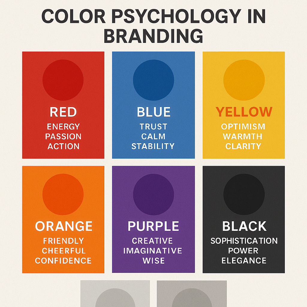
The Psychology of Primary Colors
Each primary color carries its own psychological weight and meaning.
- Red: Often associated with passion, urgency, and excitement, red is used by brands like Coca-Cola to create energy and appetite appeal.
- Blue: Symbolizes trust, calm, and reliability. That’s why financial institutions like Chase and healthcare organizations often use blue logos.
- Yellow: Evokes optimism, creativity, and warmth. Brands like McDonald’s use yellow to trigger feelings of happiness and comfort.
Choosing from primary colors gives a brand a strong emotional anchor that connects quickly with audiences.
Beyond the basics, secondary and tertiary colors allow for more nuanced communication.
Secondary and Tertiary Colors in Branding
Secondary colors—green, orange, and purple—offer opportunities for distinct brand positioning.
- Green: Represents health, nature, and growth. Whole Foods uses green to symbolize its organic, eco-friendly mission.
- Orange: Conveys creativity, playfulness, and enthusiasm. Nickelodeon’s orange logo reflects fun and imagination.
- Purple: Associated with wisdom, luxury, and creativity. Hallmark uses purple to suggest emotional richness and celebration.
Tertiary blends (like teal, magenta, or lime) provide modern twists, allowing brands to stand out in saturated markets. Color combinations at this level can communicate sophistication and originality while still aligning with values.
Now that we understand the meanings, let’s explore how color builds consistency and recognition.
Color and Brand Recognition
Color builds instant recognition—Tiffany & Co.’s robin-egg blue box. These colors aren’t just design choices; they’re strategic assets. Research shows that consistent use of color can increase brand recognition by up to 80%. When audiences repeatedly see your color palette across channels, they begin associating those colors with your brand values. Recognition transforms color into brand equity. Inconsistent use, on the other hand, dilutes impact and confuses audiences. Choosing and sticking with a palette is a long-term investment in brand trust and recall.
Beyond recognition, colors also guide how audiences feel and act.
Color as a Driver of Emotional Connection
Colors don’t just trigger recognition—they evoke emotions that influence behavior. Red “Buy Now” buttons convert at higher rates because red conveys urgency. Nonprofits often use blue and green to evoke trust and hope. Emotional connection through color makes campaigns more persuasive and memorable. Consider how charity: water uses bright blue to symbolize clean water and life. Their palette communicates hope and urgency simultaneously, compelling people to donate. Emotional alignment ensures that colors aren’t just seen but deeply felt.
To maximize this impact, brands need to balance universality with cultural context.
Cultural Variations in Color Meanings
Color meanings are not universal—they shift across cultures. In Western countries, white symbolizes purity, but in parts of Asia, it represents mourning. Red signifies good fortune in China but can mean danger in other contexts. Global brands like McDonald’s adapt their palettes to local cultures while maintaining brand recognition. For mission-driven organizations working across borders, cultural context is vital to avoid misinterpretation. Understanding cultural nuances allows brands to communicate values respectfully and effectively in diverse markets.
Now, let’s consider how industries use color strategically to reinforce brand identity.
Industry Case Studies in Color Use
Industries often develop color norms that reflect collective values.
- Healthcare: Blue and green dominate, symbolizing trust, calm, and healing. Mayo Clinic’s blue reinforces authority and professionalism.
- Technology: Companies like Dell, Intel, and Facebook use blue to convey innovation and dependability.
- Luxury: Black and gold are staples, representing exclusivity and sophistication, as seen with Rolex and Chanel.
- Food & Beverage: Red and yellow dominate because they stimulate appetite and happiness, think McDonald’s and Pizza Hut.
Studying industry patterns helps organizations decide whether to align with norms or differentiate boldly.
With these examples in mind, how do you practically choose the right palette?
Steps to Choosing the Right Palette
Selecting your brand palette should be intentional, strategic, and guided by values.
- Identify Your Values: Define what your brand stands for—innovation, sustainability, creativity, etc.
- Research Color Psychology: Understand which colors best communicate these values.
- Test Combinations: Use tools like Adobe Color to test palettes across digital and print formats.
- Consider Accessibility: Ensure your palette is legible for all audiences, including those with visual impairments.
- Document Choices: Incorporate your palette into brand guidelines for consistent use.
This process ensures your palette reflects your mission authentically and consistently.
Once your palette is chosen, consistency is key to making it part of your identity.
Maintaining Consistency Across Touchpoints
Colors only build equity if they are applied consistently across all brand channels. Websites, social media, presentations, packaging, and advertising should all use the same palette. Slack’s use of purple and rainbow accents across its platform demonstrates how consistency builds recognition. Inconsistency, however, weakens credibility and confuses audiences. Maintaining consistency is about more than aesthetics, it’s about ensuring your mission is visually reinforced at every interaction.
To illustrate these principles, let’s look at a brand that has mastered color psychology.
Case Study: Tiffany & Co. – The Power of “Tiffany Blue”
Tiffany & Co. provides one of the strongest case studies in color psychology. Its signature robin-egg blue, trademarked as “Tiffany Blue,” symbolizes luxury, exclusivity, and timelessness. The brand applies this color consistently across packaging, stores, and marketing. This singular shade has become synonymous with Tiffany’s values of elegance and romance. Customers don’t just see blue—they feel the brand promise of quality and tradition. Tiffany proves how one color, when chosen strategically, can become an enduring symbol of brand values.
This case study demonstrates what’s possible when brands use color with intention.
Color as a Strategic Asset
Color psychology in branding is more than a design trend—it’s a strategic tool for communicating mission, building recognition, and inspiring action. From primary associations to cultural nuances, color choices shape how audiences perceive and engage with your brand. Case studies like Tiffany & Co. and charity: water demonstrate the power of intentional palettes. By choosing colors rooted in your values and applying them consistently, you create a visual identity that resonates emotionally and strategically.
Colors speak before words do. They build emotion, create connection, and make your brand unforgettable.
👉 Learn how to use color intentionally with Visual Branding Works: A Real-World Playbook & Toolkit for Stronger Identity, complete with worksheets and color strategy templates.
Or let’s collaborate—Contact Vivid Creative Services to create a custom color system that captures your brand’s energy and essence.